Atelier documentation
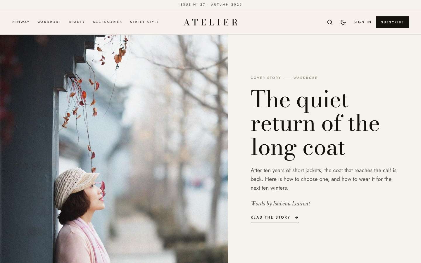
An editorial fashion and style magazine theme for Ghost, with a side-scrolling lookbook, split-screen stories and Shop the look grids.
Thank you for choosing Atelier. This guide covers everything from uploading the theme to setting up paid memberships. If something is not covered here, write to support@codememory.com — we answer within one working day.
- Version1.0.0
- Ghost6.0.0 or later
- Live demoatelier.ghostcms.templates.codememory.com
- AuthorCode Memory
Highlights
- Cover story: your newest story as a split-screen cover, image on one side and a large serif headline on the other
- The Lookbook: a side-scrolling row of your featured stories with large numerals, arrows, a counter and a progress line; drag it with a mouse or swipe it
- Slow marquee of your topics (or your own text) under the cover
- Staggered grid of portrait cards with centred captions
- Split-screen story header: the feature image fills one half of the screen, the title sits in the other
- Lookbook post template: a full-screen cover, every image numbered Look 01, Look 02… and galleries that become film strips
- Shop the look: product cards placed one after another become a numbered product grid
- Drop cap at the start of each story, and centred pull quotes between hairlines
- Issue line above the header (for example: Issue Nº 27 · Autumn 2026)
- Three-part header with a centred, wide-tracked wordmark
- Sections and Contributors page templates with portrait tiles
- Membership page with tiers and a monthly/yearly switch; styled paywall for members and paid stories
- Sign in, sign up and account pages
- Light, dark and system modes with a reader toggle
- Reading progress bar, image lightbox, galleries, tables and toggle cards
- Self-hosted fonts (Bodoni Moda with italics, Jost)
- Fully translatable, 18 theme settings, no jQuery
What is in the download
themeforest-atelier-ghost-theme/
├── documentation/                          ← you are here
├── sample-content/atelier-sample-content.json  ← optional demo posts (see Sample content)
└── atelier_1.0.0_for_ghost_6.0.0_or_later/
    ├── atelier.zip                          ← upload this file to Ghost
    └── atelier/                             ← the same theme, unzipped, with source files
You only need atelier.zip to use the theme. The unzipped folder is there for developers who
want to change the code (see Development).
Installation
- Sign in to your Ghost admin (
yoursite.com/ghost). - Go to Settings → Design & branding → Customize → Change theme.
- Click Upload theme and choose
atelier.zipfrom theatelier_1.0.0_for_ghost_6.0.0_or_laterfolder. Do not upload the whole download. - Click Activate.
Updating
When a new version is released, download it from your ThemeForest Downloads page and upload the new
atelier.zip the same way. Ghost asks whether to overwrite the existing theme — choose
Overwrite. Your content, navigation and theme settings are kept.
If you edited the theme files yourself, keep a copy of your changes first: an update replaces every file.
Quick setup (10 minutes)
To make your site look like the demo, do these steps in order. Each one is explained in detail further down.
- Brand: Settings → Design & branding → set the Accent colour, upload a logo and a site icon.
- Navigation: Settings → Navigation → add your main links (see Navigation).
- Pages: create the pages in Pages and templates and pick the matching template.
- Membership: Settings → Membership → turn on signups; add paid tiers and connect Stripe (see Membership).
- Theme settings: Design & branding → Theme tab (see Theme settings).
- Lookbook row: mark 4 to 8 stories as Featured. They appear on the homepage, oldest first.
- Images: Atelier crops card and cover images to portrait shapes (4:5 and 3:4). Upright photos look best.
- Navigation: keep the main menu to five short items so it fits beside the centred logo.
Sample content
The download includes the demo's text as a Ghost import file:
sample-content/atelier-sample-content.json. It holds 30 posts, 8 pages, 8 tags
and the demo writers, with the same templates and settings per post as the live demo. Use it to see how
Atelier looks with real content, or as a starting point you edit.
- Use a new or test site — the import adds posts next to anything you already have.
- Go to Settings → Advanced → Import/Export → Import content.
- Choose
atelier-sample-content.jsonand confirm. - Set up Navigation, page templates and theme settings as described below. Ghost does not import these from a content file.
Logo, colours and fonts
Accent colour
Settings → Design & branding → Accent colour. Atelier uses it for buttons, links, highlights and the reading-progress bar. Atelier is mostly black and bone white. Your accent colour (garnet #9B2C3A by default) is used with care: marquee marks, links on hover, list markers and the accent callout. In dark mode it is lightened automatically so it stays readable. Each topic's accent colour draws the small lines beside its name on cards.
Logo
Upload a logo in Design & branding → Brand. Without a logo, Atelier shows the site title in the theme's display font. A transparent PNG or SVG around 400 × 100 px works best. If your logo is dark, upload a light version in the Theme tab under Logo for dark mode.
Fonts
Atelier ships its own fonts (Bodoni Moda, Jost), hosted inside the theme — no requests to Google. To use different fonts, pick a Heading font and Body font in Design & branding → Brand. The theme follows your choice everywhere. Choose Theme default to go back.
Light and dark mode
In the Theme tab, Color scheme sets the default: Light, Dark or System (follows the reader's device). Readers can switch with the moon/sun button in the header or the switch in the menu; their choice is remembered on that device.
Theme settings
Settings → Design & branding → Customize. Theme settings are split between the Site wide, Homepage and Post tabs. Every setting:
| Setting | Group | Type | Default | What it does |
|---|---|---|---|---|
| Color scheme | Site wide | select | Light (Light / Dark / System) | Readers can still switch with the sun/moon button. |
| Logo for dark mode | Site wide | image | — | Optional light version of your logo for dark mode. |
| Issue label | Site wide | text | Issue Nº 27 · Autumn 2026 | Thin line above the header. Leave empty to hide it. |
| Newsletter title | Site wide | text | Letters from the atelier | Title of the newsletter box. |
| Newsletter text | Site wide | text | empty | Text of the newsletter box. Empty = site description. |
| Footer text | Site wide | text | empty | Small footer line. Empty = site description. |
| Show cover story | Homepage | boolean | On | Newest story as a split-screen cover. |
| Show marquee | Homepage | boolean | On | Moving line of text under the cover story. |
| Marquee text | Homepage | text | empty | Text of the moving line. Empty = your topics. |
| Show lookbook | Homepage | boolean | On | Side-scrolling row of your featured stories. |
| Lookbook title | Homepage | text | The Lookbook | |
| Latest title | Homepage | text | Latest stories | |
| Show share buttons | Post | boolean | On | Share buttons (X, Facebook, LinkedIn, copy link) under posts. |
| Show author box | Post | boolean | On | Author photo and bio under posts. |
| Show related posts | Post | boolean | On | Three posts from the same tag under each post. |
| Show reading progress | Post | boolean | On | Progress bar at the top of the screen while reading a post. |
| Show drop cap | Post | boolean | On | Large first letter at the start of a story. |
| Show shop grid | Post | boolean | On | Product cards in a row become a "Shop the look" grid. |
Homepage
- Cover story — the newest story, split-screen (Show cover story).
- Marquee — a slow moving line with your topic names, or your own text (Show marquee, Marquee text).
- The Lookbook — featured stories in a side-scrolling row (Show lookbook, Lookbook title).
- Latest stories — the staggered card grid with a Load more button (Latest title). Atelier shows 10 per page.
- Newsletter — a signup band for visitors who are not members (Newsletter title, Newsletter text).
Making a lookbook story
- Write a post and choose Lookbook under Template in the post settings.
- The feature image becomes a full-screen cover with the title on top. Use a large, upright photo.
- Add your looks as image cards. Atelier numbers them in order: Look 01, Look 02 and so on. Wide images work well; upright images are centred and never taller than the screen.
- Add a gallery card for a film strip: the images sit in one row that readers drag or swipe sideways.
The word Look comes from the translation file, so it follows your site language.
Shop the look
Add two or more product cards one after another (type /product in the editor). Give each an image, a title, a short description and a button with a link to the shop.
Atelier places cards that follow each other in one grid, numbers them and adds the label Shop the look. A single product card on its own stays centred in the text. Turn the grid off with Show shop grid.
Issue line and drop cap
The thin line above the header shows the text of Issue label. Change it each season, or leave it empty to hide the line.
Every story starts with a large first letter. Turn it off with Show drop cap. Lookbook stories never use it.
Pages and templates
Atelier includes page templates for the pages every membership site needs. Create a page in Ghost (Pages → New page), set its URL in the page settings, then choose the Template in the same panel.
| Template | Suggested URL | Use |
|---|---|---|
Topicscustom-topics.hbs | /topics/ | Every public tag as a portrait tile with its image, description and story count. |
Writerscustom-writers.hbs | /writers/ | Every staff user with at least one story, as a portrait that turns from black and white to colour on hover. |
Membershipcustom-membership.hbs | /membership/ | Your tiers with a monthly/yearly switch. The page body (for example a FAQ made of toggle cards) appears below. |
Signincustom-signin.hbs | /signin/ | Email sign-in form (magic link) with the page's feature image. |
Signupcustom-signup.hbs | /signup/ | Free signup form with name and email and the page's feature image. |
Accountcustom-account.hbs | /account/ | Signed-in members see their plan, renewal date, card and links to manage billing and newsletters. |
Tip: the membership page shows your tiers automatically. Anything you write in the page body appears underneath — the demo uses toggle cards for a FAQ.
Post templates
Choose a template per post in the post settings panel → Template.
| Template | Use | |
|---|---|---|
Lookbookcustom-lookbook.hbs | Full-screen cover, numbered looks and film-strip galleries. |
Membership, tiers and payments
Atelier is built for Ghost's members features: free and paid signups, tiers, a paywall and the Portal popup.
1. Turn on signups
Settings → Membership → Access → Who should be able to subscribe? → Anyone can sign up.
2. Connect Stripe
Settings → Membership → Tiers → Connect with Stripe. Use test mode first, then switch to live mode when you are ready to take real payments.
3. Create tiers
Settings → Membership → Tiers. Add a name, monthly and yearly prices, a description and benefits. Atelier shows every public tier on the membership page with a monthly/yearly switch, and marks the second tier as Most popular.
4. Members-only content
In a post's settings set Post access to Members only, Paid-members only or
specific tiers. Readers without access see the start of the post and a paywall box that invites them to join
or upgrade. To choose where the preview stops, add a Public preview divider in the editor
(type /public).
5. Sign-up forms and buttons
Subscribe forms in the theme create free members and send a confirmation email. Every Subscribe, Sign in and Account button opens Ghost's Portal popup, so members can change plans, update cards and cancel without leaving your site.
config.production.json.Reading features
- Reading progress bar on posts, in the post's topic colour (can be turned off in the Post tab).
- Image lightbox: click any image or gallery photo in a post to see it full screen; use the arrow keys to move through a gallery.
- Every editor card is styled: images (regular, wide, full), galleries, quotes, callouts, toggles, bookmarks, buttons, videos, audio, files, products, headers and signups. Create a page with every card to check your brand — the demo's style guide shows them all.
Posts per page
The home, tag and author pages load 10 posts, then a
Load more button fetches the next set without reloading the page. To change the number, edit
"posts_per_page" in package.json, zip the theme folder and upload it again.
Translation
Every word in the theme can be translated.
- In the unzipped theme folder, copy
locales/en.jsonto a new file named after your language code, for examplelocales/fr.json. - Translate the values (the text on the right). Keep the keys (the text on the left) and anything in
{curly braces}unchanged. - Zip the theme folder and upload it.
- Settings → General → Publication language → enter the same code (
fr).
Custom CSS
Small style changes do not need a new theme upload. Settings → Code injection → Site header:
<style>
.logo { letter-spacing: .2em; }
.marquee-track { animation-duration: 80s; }
</style>
Development
For larger changes, work on the unzipped atelier/ folder. You need Node.js 20 or later.
cd atelier
npm install        # once
npm run dev        # rebuild CSS/JS on every change
npm run build      # one-off build
npm test           # check the theme with gscan
npm run zip        # dist/atelier.zip, ready to upload
CSS lives in src/css (one file per area, joined by main.css); JavaScript in
src/js. Built files go to assets/built. Templates are Handlebars files in the theme root
and in partials/.
Questions
The homepage looks empty after I activated the theme.
The home sections use your posts, featured posts and tags. Publish a few posts, mark some as Featured and add tags. The Lookbook row appears once you mark stories as Featured.
The membership page shows no prices.
Paid tiers only appear once Stripe is connected and the tiers are public (Settings → Membership → Tiers).
Sign-in emails do not arrive.
Check your email settings (self-hosted: Mailgun or SMTP in the config file). Ask readers to look in their spam folder.
How do I remove "Published with Ghost" from the footer?
Delete the link from partials/footer.hbs in the unzipped theme, zip the folder and upload it again.
Can I use the theme on more than one site?
A Regular licence covers one site (one end product). Buy one licence per site.
Are the demo images included?
No. Demo photos come from Pixabay and are only used on the demo site. The theme itself contains no stock photos.
Support
Support is included with your purchase and covers: answering questions about the theme's features, and fixing bugs. It does not cover custom changes or problems with third-party code.
Email support@codememory.com with your purchase code and your site address. See the changelog for what changed in each version and third-party materials for credits.